Which acrylic paint colors are good for landscape painting?
Leave a message
Hey there, fellow art enthusiasts! I'm an acrylic paint color supplier, and I've been in the business long enough to know which colors work like magic for landscape painting. Today, I'm gonna spill the beans on the best acrylic paint colors for capturing the beauty of the great outdoors.
The Basics: Primary and Secondary Colors
Let's start with the primary colors - red, blue, and yellow. These are the building blocks of your color palette. With just these three, you can mix up a whole rainbow of shades. For landscapes, a good red like cadmium red can add warmth to sunsets or the glow of a fire. Ultramarine blue is a classic for the sky and water, giving you that deep, rich color. And cadmium yellow is perfect for the bright sunlight or the golden hues of fields.
Secondary colors - green, orange, and purple - are also super important. Green is obviously essential for trees, grass, and foliage. A mix of blue and yellow can create a range of greens, from the bright lime green of new leaves to the dark forest green. Orange, made by mixing red and yellow, can be used for autumn leaves or the reflection of the setting sun on the water. Purple, a blend of red and blue, is great for shadows and the moody tones of a twilight sky.
Earth Tones
Earth tones are a must-have for landscape painting. They add realism and depth to your work. Burnt sienna and burnt umber are two of my favorites. Burnt sienna has a warm, reddish - brown color that's perfect for soil, rocks, and the trunks of trees. Burnt umber, on the other hand, is a darker, more earthy brown that can be used for shadows and the base colors of mountains.

Raw sienna and raw umber are also useful. They're lighter and more yellow - toned than their burnt counterparts. Raw sienna can be used for the sandy beaches or the early morning light on a field, while raw umber can add a touch of depth to the greenery.
Blues for the Sky and Water
The sky and water are some of the most prominent elements in a landscape. For the sky, you can use a range of blues. Cerulean blue is a light, bright blue that's great for a clear, sunny sky. Phthalo blue is a very intense, deep blue that can be used for stormy skies or the deep parts of the ocean.
When it comes to water, you'll need to mix different blues and greens. For example, a mix of cerulean blue and a little bit of yellow can create a light, turquoise - like color for shallow water. Adding some phthalo blue can make it look deeper and more mysterious. You can also use white to lighten the colors for the highlights on the water.
Greens for Foliage
As I mentioned before, green is crucial for foliage. Sap green is a lovely, natural - looking green that's great for leaves. It has a bit of a yellow undertone, which gives it a fresh, lively look. Viridian green is a darker, more intense green that can be used for the shadows in the trees or for evergreen foliage.
You can also mix your own greens. For example, a mix of phthalo blue and cadmium yellow can create a bright, vivid green. Adding a bit of burnt sienna can make it look more like the color of old leaves.
Reds and Oranges for Sunsets and Autumn
Sunsets and autumn are all about warm colors. Cadmium red light and cadmium red deep are both great for sunsets. The light red can be used for the softer, pastel - like colors at the edge of the sky, while the deep red can create the intense, fiery center of the sunset.
For autumn leaves, orange is the star. Cadmium orange is a bright, bold color that can really make the leaves pop. You can also mix your own oranges by combining red and yellow. Adding a bit of brown can make the orange look more like the color of real autumn leaves.
Tips for Using Acrylic Paints in Landscape Painting
Now that you know which colors to use, here are some tips on how to use them effectively. First of all, don't be afraid to mix colors. Acrylic paints are very versatile, and you can create a wide range of shades by mixing just a few primary colors.
Second, build up your layers. Start with a light base color and then add darker colors for shadows and details. You can also add lighter colors for highlights. This will give your painting more depth and dimension.
Finally, take your time. Landscape painting is all about capturing the beauty of nature, and that takes patience. Don't rush the process, and enjoy the journey.
Related Paint Types
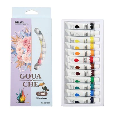
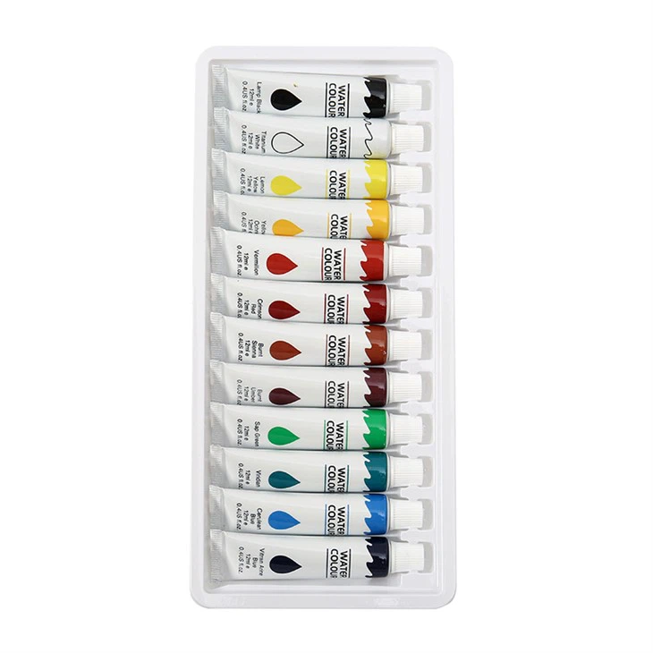
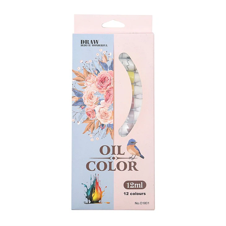
If you're also interested in other types of painting, check out these links. For Watercolor Paint Ideas, you can find some inspiration for creating beautiful watercolor landscapes. If you prefer the rich, textured look of oil paints, Oil Color Paint might be the way to go. And if you're new to watercolor painting, Watercolor Paint is a great place to start.
Let's Connect
I hope this blog has been helpful in guiding you through the best acrylic paint colors for landscape painting. As an acrylic paint color supplier, I have a wide range of high - quality paints that can bring your landscape paintings to life. Whether you're a beginner or a professional artist, I'm here to help you find the perfect colors for your next masterpiece.
If you're interested in purchasing our acrylic paint colors, or if you have any questions about which colors would be best for your specific project, don't hesitate to reach out. Let's start a conversation and see how we can work together to make your artistic vision a reality.
References
- "Acrylic Painting Techniques" by Joe Fenton
- "Landscape Painting with Acrylics" by Mary Whyte